Rate This Board allows a billboard designer to rate a random piece of billboard artwork using the following scale: 1 (not good), 2 (below average), 3 (average), 4 (very good), 5 (great). Then the designer talks about what they may have done differently for outdoor advertising. Today’s rating is provided by Greg Callaham www.gregcallaham.com) who has 30 years of experience in outdoor advertising design. Insider uses and endorses Callaham’s services.
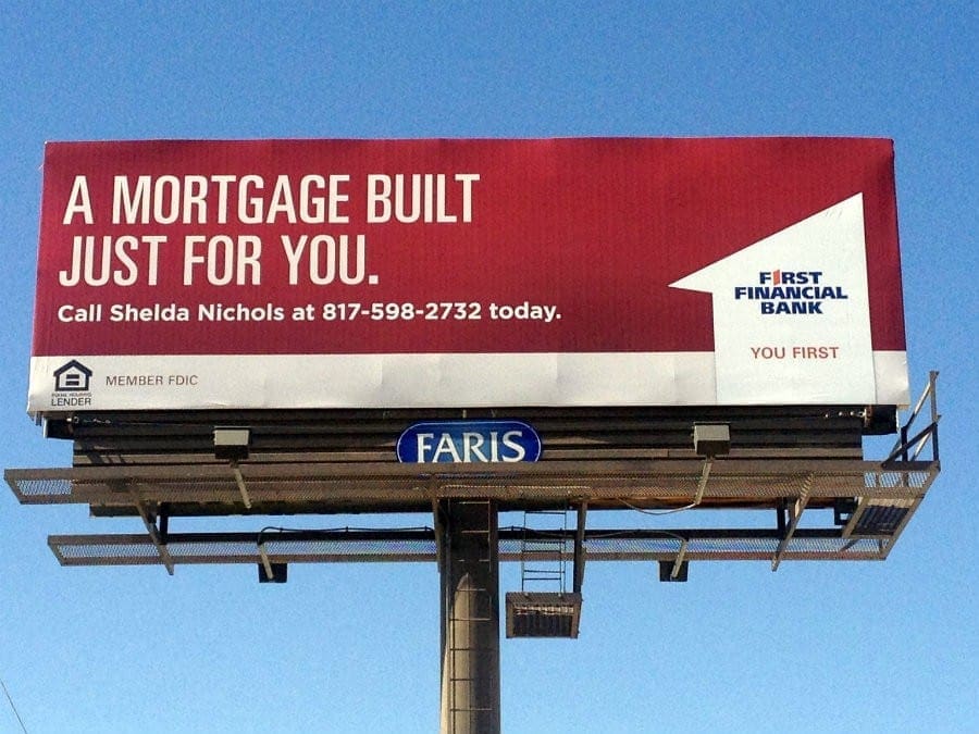
First Financial Bank
Rating: 2 (below average)
- This board for a bank is a good example of a very nice magazine ad. The rich vibrant color catches the eye and conveys that sense of solid financial responsibility banks want the target audience to feel. The number 1 cleverly converted to a graphic is nice and reinforces the name of the advertiser. But only part of this works for outdoor.
- The headline is large enough to read and offers good contrast with the background. It needs to be bolder to increase legibility.
- Everything else is too small to be read. While this may comply with the client’s branding standards or their art direction, the level of difficulty in reading the ad has a direct impact on the effectiveness of the ad, the advertiser satisfaction with the product, and the effort involved in the renewal. I’m afraid this one earned a 2 (below average).
- My suggestion for a more legible and more effective ad that maintains the spirit of the client’s branding is below:

[wpforms id=”9787″]
Paid Advertisement
