Rate This Board allows a billboard designer to rate a random piece of billboard artwork using the following scale: 1 (not good), 2 (below average), 3 (average), 4 (very good), 5 (great). Then the designer talks about what they may have done differently for outdoor advertising. This weeks rating is provided by Greg Callaham www.gregcallaham.com) who has 30 years of experience in outdoor advertising design. Insider has used and endorses Callaham’s services.
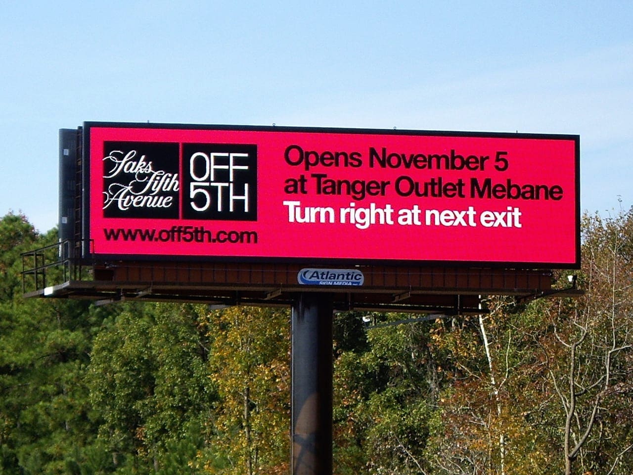
Saks Fifth Avenue
Rating: 4 (Very Good)
- Nice job! This is a very legible board that conveys its message rather well. It earns a solid 4 (very good).
- There’s not much that will draw the eye like a large brightly colored light. That’s what this digital board for Saks Fifth Avenue is. You have to look at it, much like a moth regards a porch light. And it’s pretty easy to read.
- Digital is a bit more forgiving of the black text on red background combination than print, so that works here.
- I’d like to see the kerning spread out some to reduce the challenge for drivers, especially for the web address, but that’s most likely something dictated by the Saks branding standards.
- I’d also like to see the white directional moved down so the bottom aligns with the bottom of the web address. That would give the board better balance and stop it from visually trying to tilt to the left a little bit.
- It’s 2018. No need for the “www.” in front of a web address.
[wpforms id=”9787″]
Paid Advertisement








This board is unnecessarily long! Bill Lear the aircraft builder famously said, “I would sell my mother for 100lbs of weight in an airplane. Well, that’s how WORDS should be treated on a billboard. Too many people view a billboard as they would a print ad. Here are my suggestions:
1) lose the domain – anyone with a smartphone can simply ask their phone. Then the cursive Saks logo can be much larger, since it is already difficult to read while driving past at highway speeds
2) “Right Next Exit” is plenty of information! You don’t need to remind people that they need to turn the wheel to go right. And, you just eliminated 2 unnecessary words
3) Eliminate “at” and “Mebane”. Is anyone seriously going to take the Next Exit, Turn Right, then ask if this is the Tanger Outlet in Mebane? 2 more unnecessary words.
5 words, including the domain eliminated and a board a passerby can digest! Finally, I would like to see digital being used to its fullest. You could load up 10 +/- designs with each one stating how many days left until opening and help build anticipation.