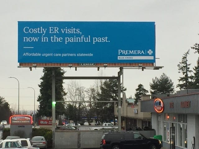
Rate This Board allows a billboard designer to rate a random piece of billboard artwork using the following scale: 1 (not good), 2 (below average), 3 (average), 4 (very good), 5 (great). Then the designer talks about what they may have done differently for outdoor advertising. This week’s rating is by Greg Callaham (www.gregcallaham.com) who has 30 years of experience in outdoor advertising design. Insider uses and endorses Callaham’s services.
Design: Premera Blue Cross
Rating: 3 (average)

- Here’s a blue billboard that tells me costly ER visits are now a thing of the past. I wonder why? I wonder where?
- The headline text is large enough to offset the thinness of the font, but it’s legible to the target audience only because this is on a lower speed surface street and not an interstate.
- There’s a subhead that is too small to read and would actually have been a more informative headline.
- And the logo is too small. How many times must we say that? If the decision is made to run a text-only billboard, drive your message home with a large bold feature/benefit (Affordable Urgent Care Partners Statewide) and a large, clear logo or name of the supplier of said feature/benefit (Premera Blue Cross).
[wpforms id=”9787″]
Paid Advertisement


