Rate This Board allows a billboard designer to rate a random piece of billboard artwork using the following scale: 1 (not good), 2 (below average), 3 (average), 4 (very good), 5 (great). Then the designer talks about what they may have done differently for outdoor advertising. This week’s rating is provided by Melody Roberts, an OBIE nominated billboard designer and founder of Out of Home Creative, an outdoor advertising design firm specializing in out of home design for businesses, agencies, media buyers and out of home companies. Melody has been in the outdoor industry since 1999.
Chiquita
Rating 4 (good)
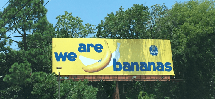
- The execution is fun, simple and bold. This billboard is a street surface location in a busy area of Atlanta, Georgia and perfect for branding.
- Chiquita’s company colors are Yellow and Blue so it was natural they would stick within those colors and they’re great for outdoor advertising.
- Even though their logo is identifiable, I would have advised to make it larger.
- I don’t know if they were aware the location was backed up to trees, in this companies case their colors really allow it to stand out against the foliage.
- I love how the banana seems as if it was coming out of the vinyl. The only reason I gave this a 4 instead of a 5 is because the designer should have incorporated a better drop shadow behind the banana. I believe there’s a faint drop shadow but not enough to give it dimension and the feeling that it is really coming off the board.
[wpforms id=”9787″]
Paid Advertisement
