Rate This Board allows a billboard designer to rate a random piece of billboard artwork using the following scale: 1 (not good), 2 (below average), 3 (average), 4 (very good), 5 (great). Then the designer talks about what they may have done differently for outdoor advertising. This week’s rating is provided by Melody Roberts, an OBIE nominated billboard designer and founder of Out of Home Creative, an outdoor advertising design firm specializing in out of home design for businesses, agencies, media buyers and out of home companies. Melody has been in the outdoor industry since 1999.
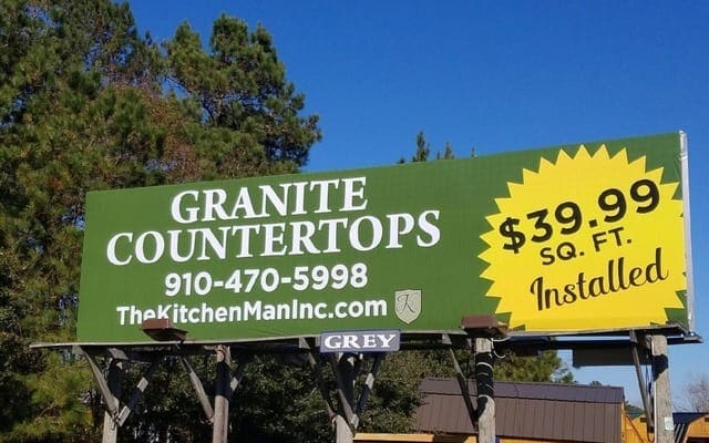
The KitchenManInc.com
Rating 3 (Average)
- I like that the client’s advertisement focused on one service and used OOH to target their audience with a price point. In this service category they could have listed 3 or more services which would have cluttered the Ad.
- I’m not sure if this was discussed at the inception but in my experience, I would discuss two things regarding the Yellow starburst; 1) To upsell it as an extension and 2) Offer it as a snipe area. If the advertisement is going to be up for more than 90 days, snipes can help an advertiser get more bang for their buck by changing their information in a specific area vs reprinting a vinyl.
- I believe the billboard location is surface street which will help people trying to read the website (a little obscured by the catwalk light). It is important for Operations or Sales to communicate with the billboard designer if a board has any obstructions (trees, lights, etc.) so the designer knows where to not place content.
- I rated this a 3 because even though the advertisement is easy to read, I felt it could have had more of a creative touch. My recommendations are:
- Use a different background color than Green against Green trees.
- Only list the website (no number), move it up so it’s not obscured by the light and consider putting a line between “Countertops” and the website to separate.
- Starburst: make it an extension using the whole image (as it is now it feels unfinished), have the $ and .99 smaller so “39” can be much larger and turn it facing inward vs out.
[wpforms id=”9787″]
Paid Advertisement








Nice idea for an article and Melody did a great writeup. We all know there are more BAD billboard layouts out there than GOOD. Another idea would have been to replace the starburst with a slab of granite (with the rough edges) and made an extension of the right hand side of the board. Then put the price and copy on top of this element.
As a side note, the following domain is avail and would have probably helped to spice this ad up as well………… “BitchenKitchenMan.com” 🙂