


Rate This Ad allows a billboard designer to rate a random piece of billboard artwork using the following scale: 1 (not good), 2 (below average), 3 (average), 4 (very good), 5 (great). Then the designer talks about what they may have done differently for outdoor advertising. This week’s rating is provided by Greg Callaham (www.gregcallaham.com) who has over 30 years of experience in outdoor advertising design. Insider uses and endorses Callaham’s services.
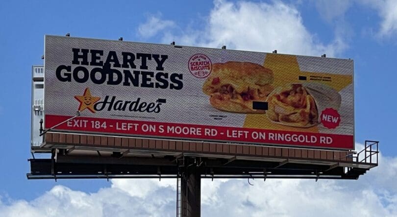
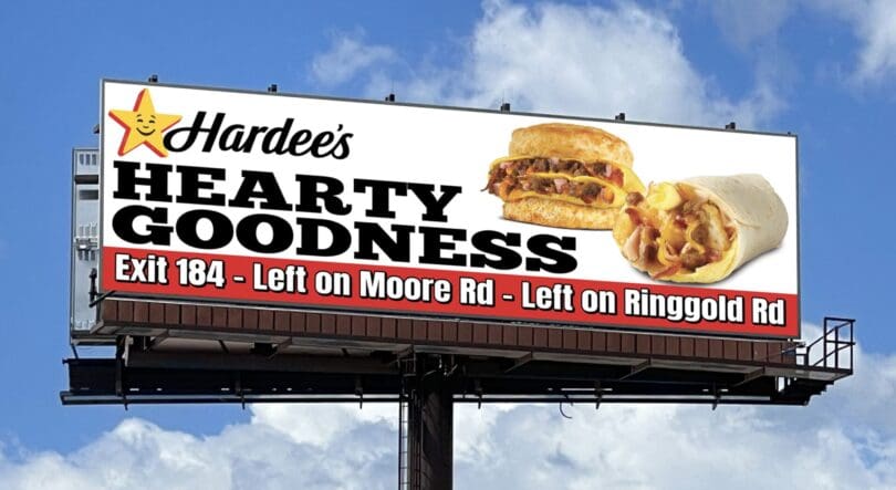
Hardees
Rating: 2 (Below Average)
- This Hardee’s ad promotes two of their breakfast entrees with a clever play on words.
- Unfortunately, the hero shots of the food are partially camouflaged by an unnecessary background graphic.
- Additionally, a starburst and feature logo create unreadable distractions from the products the ad is trying to sell.
- The logo is bit smallish; and the directional is typeset too small and is far too long to be in all caps. This ad earns a 2 (below average).
As always, I do not know the details of the art request or components of the campaign this ad may or may not have been part of. But looking at this challenge with the eye of an OOH graphic designer and through the lens of the target audience, I would have urged the advertiser to run the ad pictured below to promote the same message:
To receive a free morning newsletter with each day’s Billboard insider articles email info@billboardinsider.com with the word “Subscribe” in the title. Our newsletter is free and we don’t sell our subscriber list.
Paid Advertisement