


Rate This Ad allows a billboard designer to rate a random piece of billboard artwork using the following scale: 1 (not good), 2 (below average), 3 (average), 4 (very good), 5 (great). Then the designer talks about what they may have done differently for outdoor advertising. This week’s rating is provided by Greg Callaham www.gregcallaham.com) who has over 30 years of experience in outdoor advertising design. Insider has used and endorses Callaham’s services.
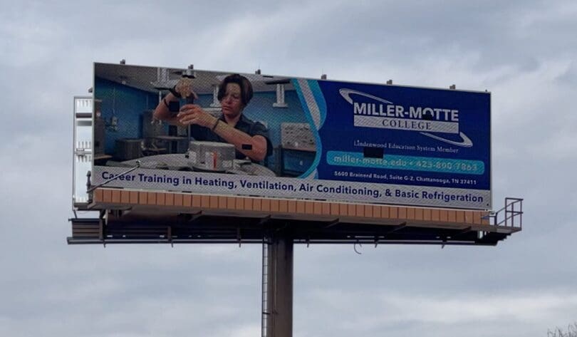
Miller Motte College
Rating: 1 (not good)
- This ad promotes a trade school with several local campuses. Unfortunately, it conveys almost no important information to the target demographic.
- The name of the college is near the top and fairly easy to read, but all the other text in the ad is too small for the interstate cross-read audience to see. That means they will not read, understand, or remember it.
- There are too many words for this to be an effective OOH investment.
- The photo depicts a student doing something, but it is not readily apparent what that something is. This ad earns a 1 (not good).
As always, I do not know the details of the art request or components of the campaign this ad may or may not have been part of. But looking at this challenge with the eye of an OOH graphic designer and through the lens of the target audience, I would have encouraged the advertiser to run the ad pictured below to promote their message in a similar style.

To receive a free morning newsletter with each day’s Billboard insider articles email info@billboardinsider.com with the word “Subscribe” in the title. Our newsletter is free and we don’t sell our subscriber list.
Paid Advertisement


Is it necessary to include the website and phone number? Everyone has a smartphone. If the ad gets their attention, they can Google that info in 2 seconds.