


Rate This Ad allows a billboard designer to rate a random piece of billboard artwork using the following scale: 1 (not good), 2 (below average), 3 (average), 4 (very good), 5 (great). Then the designer talks about what they may have done differently for outdoor advertising. This week’s rating is provided by Greg Callaham www.gregcallaham.com) who has over 30 years of experience in outdoor advertising design. Insider has used and endorses Callaham’s services.
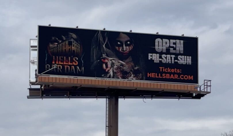
Hells Bar Dam
Rating: 3 (average)
- The haunted house ad pictured above is super creepy.
- The first thing one sees is the logo. It’s a great logo design, but the lettering fades to black a bit too much and the building is too dim to recognize in this usage.
- The visual in the center grabs the eye, instantly letting the viewer know there is something scary afoot.
- The open-and-days verbiage has good contrast with the background and is easy to read.
- The contact info is a bit iffy on contrast and size. And that interferes with communicating the where and how part of the message.
- The potential is there for more kick overall, but it’s just not realized. This ad earns a 3 (average).
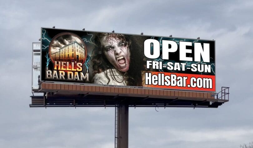
As always, I do not know the details of the art request or components of the campaign this ad may or may not have been part of. But looking at this challenge with the eye of an OOH graphic designer and through the lens of the target audience, I would have encouraged the advertiser to run the ad pictured below to promote the same message in a similar style.
To receive a free morning newsletter with each day’s Billboard insider articles email info@billboardinsider.com with the word “Subscribe” in the title. Our newsletter is free and we don’t sell our subscriber list.
Paid Advertisement


I definitely like the second version better!
I would give the original a 1. Way too dark. Nothing pops. Logo not legible.