


Rate This Ad allows a billboard designer to rate a random piece of billboard artwork using the following scale: 1 (not good), 2 (below average), 3 (average), 4 (very good), 5 (great). Then the designer talks about what they may have done differently for outdoor advertising. This week’s rating is provided by Greg Callaham (www.gregcallaham.com) who has over 30 years of experience in outdoor advertising design. Insider has used and endorses Callaham’s services.
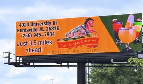
Mexican Restaurant
Rating: 2 (Below Average)
- This ad for a Mexican restaurant leaves a lot to be desired. From the full address in the primary visual position, to the thinner font for the directional, to the lack of contrast between the background and the business name, this billboard does little to help the advertiser get the target audience in the door.
- I suspect the advertiser designed it themselves or art directed it to this point, ignoring the advice of experienced OOH professionals.
- The ad earns a 2 (below average).
As always, I do not know the details of the art request or components of the campaign this ad may or may not have been part of. But looking at this challenge with the eye of an OOH graphic designer and through the lens of the target audience, I would have urged the advertiser to run the ad pictured below to promote the same message:

To receive a free morning newsletter with each day’s Billboard insider articles email info@billboardinsider.com with the word “Subscribe” in the title. Our newsletter is free and we don’t sell our subscriber list.
Paid Advertisement


Or just get rid of the diagonal line effect altogether, use straight lines, flip the colors and make it look like a Mexican flag… I might also flip the drinks and the mileage too. Ps Mexican for lunch anyone? lol
3 1/2 miles away why do you need to put the city state and ZIP Code. The colors match the background real well. The only thing is you can’t distinguish the items from all the other colors. TM.