


Rate This Ad allows a billboard designer to rate a random piece of billboard artwork using the following scale: 1 (not good), 2 (below average), 3 (average), 4 (very good), 5 (great). Then the designer talks about what they may have done differently for outdoor advertising. This week’s rating is provided by Greg Callaham www.gregcallaham.com) who has over 30 years of experience in outdoor advertising design. Insider has used and endorses Callaham’s services.
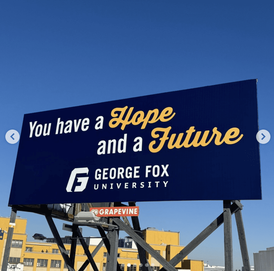
George Fox University
Rating: 3 (Average)
- The ad picture here is clean, crisp, and easy to read, even with the two words in script.
- There is plenty of contrast, it uses the advertiser colors.
- However, it lacks a bit of kick or visual interest to really catch the eye of the target audience and make them look at the ad. It’s a good ad, but not a great ad.
- This ad earns a 3 (average).
As always, I do not know the details of the art request or components of the campaign this ad may or may not have been part of. But looking at this challenge with the eye of an OOH graphic designer and through the lens of the target audience, I would have urged the advertiser to run the ad pictured below to promote the same message:

To receive a free morning newsletter with each day’s Billboard insider articles email info@billboardinsider.com with the word “Subscribe” in the title. Our newsletter is free and we don’t sell our subscriber list.
Paid Advertisement


I don’t like the word “Hope “. T C McLeod Advertising – Saginaw, Michigan.