Rate This Ad allows a billboard designer to rate a random piece of billboard artwork using the following scale: 1 (not good), 2 (below average), 3 (average), 4 (very good), 5 (great). Then the designer talks about what they may have done differently for outdoor advertising. This week’s rating is provided by Greg Callaham www.gregcallaham.com) who has over 30 years of experience in outdoor advertising design. Insider has used and endorses Callaham’s services.

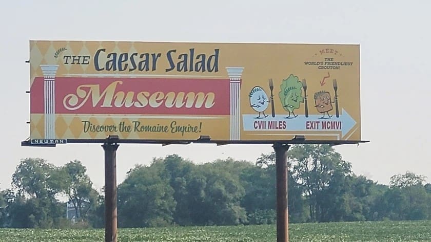
Caesar Salad Museum
Rating: 2 (Below Average)
- This is an ad for a fictitious client, The Caesar Salad Museum. I love the retro look and feel. From the diamond background to the vegetables that make my brain sing “let’s all go to the lobby” this ad exudes nostalgia. Unfortunately, the cool factor does not carry the day.
- The styling ultimately creates confusion and that is what we are not supposed to do.
- The call to action is small and in script, which is two strikes against it.
- There’s a unique feature that is identified in text too small to read in the upper right. And the directional mileage is in Roman numerals.
- Don’t get me wrong; I understand the jokes. But someone went to the trouble to post this pun-laden ad and John Q. Public cannot read it very easily. So, did they achieve their goal? That’s difficult to answer since we do not know what the “advertiser” wanted to accomplish. This ad earns a 2 (below average).
To receive a free morning newsletter with each day’s Billboard insider articles email info@billboardinsider.com with the word “Subscribe” in the title. Our newsletter is free and we don’t sell our subscriber list.
Paid Advertisement


The roman numerals are clever but too small and not helpful for those of us who don’t remember them all. I’m very interested to know who paid for a fictitious museum ad or if it was filler in between paid advertisers. It’s somewhat humorous, but I can’t help but think there’s a worthy non-profit that could benefit from the exposure. It might make a clever ad for the billboard company if executed differently.