


Rate This Ad allows a billboard designer to rate a random piece of billboard artwork using the following scale: 1 (not good), 2 (below average), 3 (average), 4 (very good), 5 (great). Then the designer talks about what they may have done differently for outdoor advertising. This week’s rating is provided by Greg Callaham www.gregcallaham.com) who has over 30 years of experience in outdoor advertising design. Billboard Insider uses and endorses Callaham’s services.
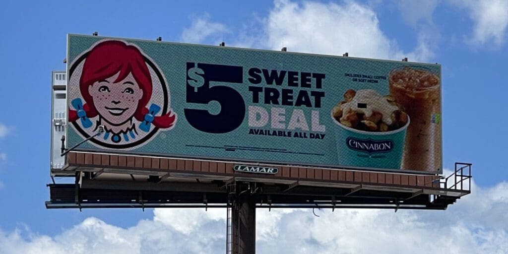
Sweet Treat Deal
Rating: 3 (average)
- The Wendy’s ad pictured here features a large logo, large text for the selling message, and large product photos. That usually checks the right boxes. However, there is one more box it mostly misses: contrast.
- The black text does not have enough contrast with the background to grab the target audience by the retinas and make it easy for them read the message.
- In addition, one of the products blends into the background. That’s also known as camouflage, which is not good for getting your product noticed by prospects.
- This ad earns a 3 (average).
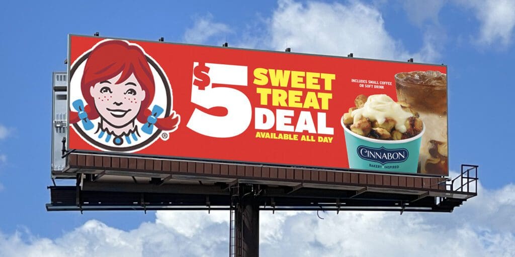
As always, I do not know the details of the art request or components of the campaign this ad may or may not have been part of. But looking at this challenge with the eye of an OOH graphic designer and through the lens of the target audience, I would have urged the advertiser to run the ad pictured below to promote the same message:
To receive a free morning newsletter with each day’s Billboard insider articles email info@billboardinsider.com with the word “Subscribe” in the title. Our newsletter is free and we don’t sell our subscriber list.
Paid Advertisement