


Rate This Ad allows a billboard designer to rate a random piece of billboard artwork using the following scale: 1 (not good), 2 (below average), 3 (average), 4 (very good), 5 (great). Then the designer talks about what they may have done differently for outdoor advertising. This week’s rating is provided by Greg Callaham www.gregcallaham.com) who has over 30 years of experience in outdoor advertising design. Insider has used and endorses Callaham’s services.
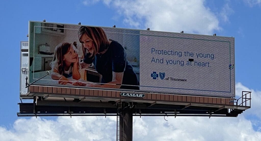
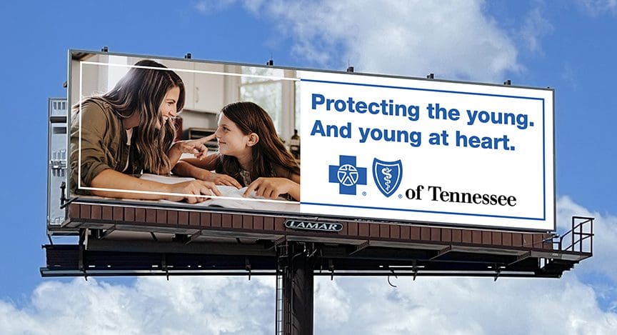
Protecting the Young
Rating: 2 (below average)
- This ad suffers from small-thin-text-and-teeny-tiny-logo disease. And, unfortunately, it’s far too common. But there is a simple cure: Make important elements large enough for your target audience to read.
- I suspect this ad was provided to the operator by the advertiser. And I suspect the advertiser has a long comprehensive set of branding standards with which all the advertising they produce must comply. However, if the prospects cannot read the selling message, it doesn’t matter if the ad complies with branding standards or not. The message still must be large enough to read for the ad to work.
- This ad earns a 2 (below average).
As always, I do not know the details of the art request or components of the campaign this ad may or may not have been part of. But looking at this challenge with the eye of an OOH graphic designer and through the lens of the target audience, I would have urged the advertiser to run the ad pictured below to promote the same message:
To receive a free morning newsletter with each day’s Billboard insider articles email info@billboardinsider.com with the word “Subscribe” in the title.Our newsletter is free and we don’t sell our subscriber list.
Paid Advertisement