


Rate This Board allows a billboard designer to rate a billboard ad using the following scale: 1 (not good), 2 (below average), 3 (average), 4 (very good), 5 (great). Then the designer recommends how to improve the ad. This week’s rating is provided by Melody Roberts, an OBIE nominated billboard designerand founder of Out of Home Creative, an outdoor advertising design firm specializing in out of home design for businesses, agencies, media buyers and out of home companies. Melody has been in the outdoor industry since 1999. Insider uses and endorses her services.
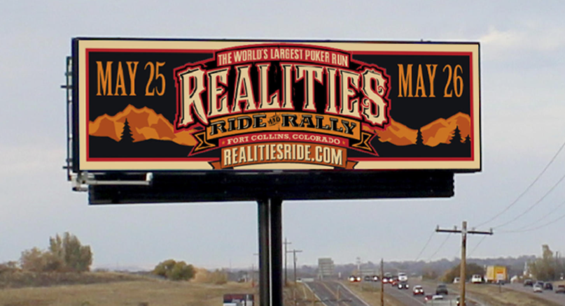
Realities Ride
Rating 2 (below average)
Please Note: For all ratings, I don’t know if a client insisted on certain elements or how much experience the designer had with out of home advertising. My recommendations requested by Billboard Insider are solely based on how I would have approached the creative design.
I’m rating this a two because I think the overall look is fun and creative, but I’m not sure it’s effective for OOH.
In my opinion, this is an example of how a logo does not translate well for outdoor advertising because all the different font styles, sizes and colors look crammed on a billboard and it is difficult to read each line.
I have to zoom in on my computer to read all of the wording and go to the website to understand what this billboard is advertising. They probably wanted to drive people to the website, but I think it would have been helpful to make the URL separate because the driver can’t zoom in to read this like I’m having too from two feet away.
Recommendations for layout would have been:
- Place the logo on the Left
- On the Right, combine the dates and don’t repeat the word “May” (ex: May 25 & 26)
- The URL could have gone underneath the dates and made larger, therefore, easier to read
- Also, by moving the URL under the dates, it allows the logo to be larger
I am not implying people will then be able to read the logo, but the above modifications may have helped this overall.
When I went to the website to find out what this was about, I read this is for a wonderful cause; to come together to make every mile help a child in need with all proceeds benefiting the Realities For Children Charities Emergency Fund for Larimer County Youth who have been abused, neglected or are at-risk. I think an edited version of this, “Every Mile Helps a Child” may have been helpful to know on the advertisement and maybe even a motorcycle visual to tie it all in.
[wpforms id=”9787″]
Paid Advertisement