


Rate This Board allows a billboard designer to rate a random piece of billboard artwork using the following scale: 1 (not good), 2 (below average), 3 (average), 4 (very good), 5 (great). Then the designer talks about what they may have done differently for outdoor advertising. This weeks rating is provided by Greg Callaham www.gregcallaham.com) who has 30 years of experience in outdoor advertising design. Insider has used and endorses Callaham’s services.
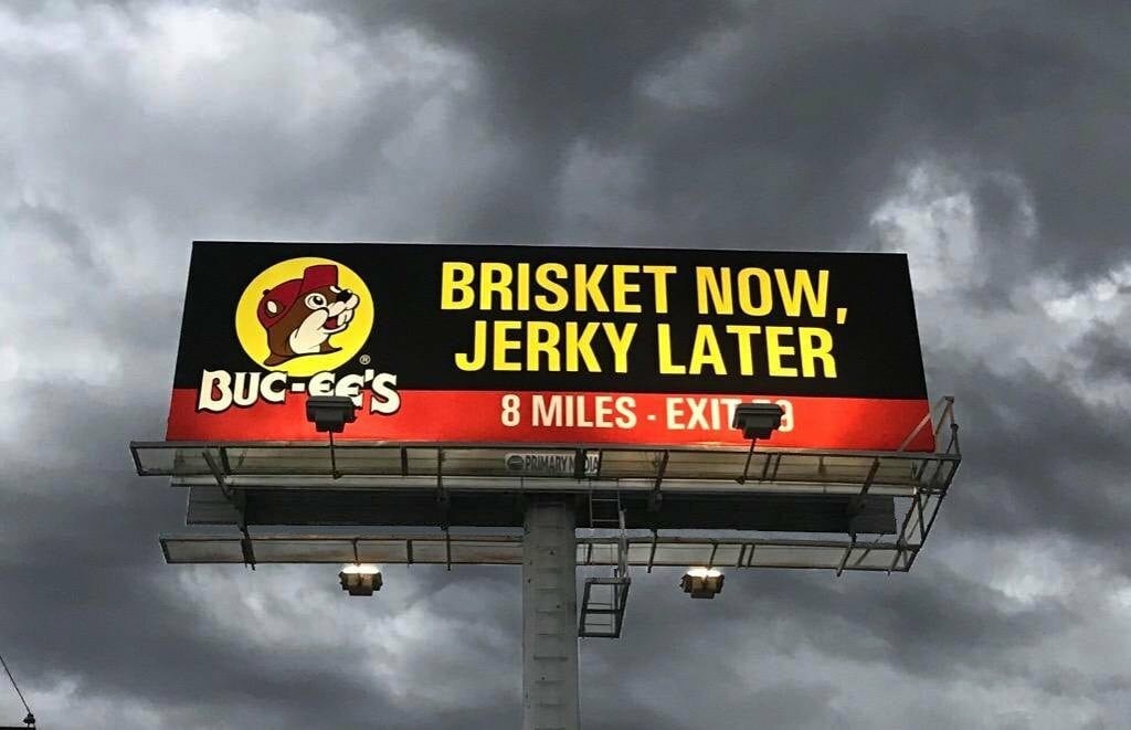
Brisket Now
Rating: 5 (Great)
Nice work! Whoever designed this did a very good job!
- Big visual interest on the left attracts the eye to start the read-understand-remember process. In this case, it’s the logo so the first thing the target audience sees is who the message is from.
- Next the eye travels to the selling message of “stop and eat now and buy something to eat on the road later.”
- Large, high-contrast, sans-serif, yellow text nearly leaps off the black background. Remember this the next time an advertiser tells you they want something to “pop.” This dares the eye NOT to read it.
- A simple red color bar across the bottom pulls the eye to the expected location for directional information.
- The white letters read very well and convey the pertinent information quickly and easily.
This, folks, is a billboard that is easily seen, easily read, easily understood, and is easy to remember. It may not win a design award, but it works for the advertiser and that is our first priority as OOH pros. This one earns a 5 (great).
[wpforms id=”9787″]
Paid Advertisement


Love it, powerful, simple, the colors go with their graphics in -store.
My team and Buc-ee’s created the artwork. We create nice clean and great outdoor! Thanks Greg for the great rating!
This is awesome! We love the recognition for this.. Our design team, and Buc-ee’s designed this ad for one of their many locations with Primary Media.. We are truly honored by this. Thank you all!