


Rate This Board allows a billboard designer to rate a random piece of billboard artwork using the following scale: 1 (not good), 2 (below average), 3 (average), 4 (very good), 5 (great). Then the designer talks about what they may have done differently for outdoor advertising. Today’s rating is provided by Greg Callaham www.gregcallaham.com who has 30 years of experience in outdoor advertising design. Insider has used and endorses Callaham’s services.
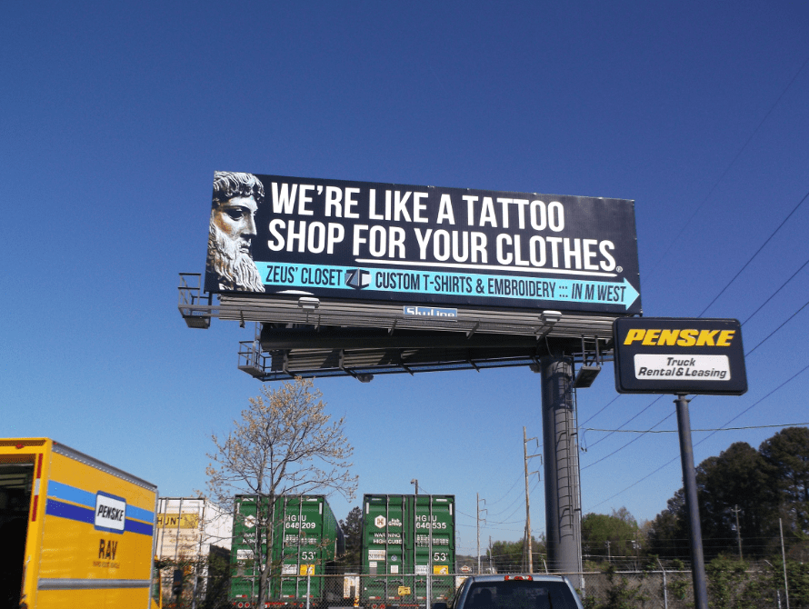
Zeus’ Closet
Rating: 3 (average)
- This board for Zeus’ Closet has a headline that’s easy to read and an arrow that points to the right. And that is about all the target audience is going to get from this ad.
- The business name and logo are far too small to be easily read.
- All the text is in all caps, making it more difficult to read. The word count is a tad high, too.
- I understand why the face of the statue of Zeus is there, because I’ve had time to sit and read the entire ad. However, aside from the business name, which is already accompanied by a logo, there is no need for it to be there.
- The visual should link directly to the product/service and the advertiser does not claim to sell statues. Let’s see a nice embroidery sample or a shirt with “Your Logo Here” on it.
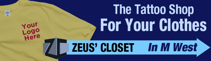
If given the option, I would have encouraged the advertiser to go in a direction more like this:
[wpforms id=”9787″]
Paid Advertisement


I agree with your improvements. I even rated it one mark lower at a [2]. Maybe because I hadn’t finished my morning coffee yet, but I read the sign multiple times before I realized it was not two separate sentences. Your example with “tattoo” and “shop” on the same line is a must for readability. Because when morning drivers read it, their coffee probably hasn’t kicked in either.
How can I have some of my company’s work be submitted to the review process on our art work