


Rate This Board allows a billboard designer to rate a random piece of billboard artwork using the following scale: 1 (not good), 2 (below average), 3 (average), 4 (very good), 5 (great). Then the designer talks about what they may have done differently for outdoor advertising. This weeks rating is provided by Greg Callaham www.gregcallaham.com) who has 30 years of experience in outdoor advertising design. Insider has used and endorses Callaham’s services.
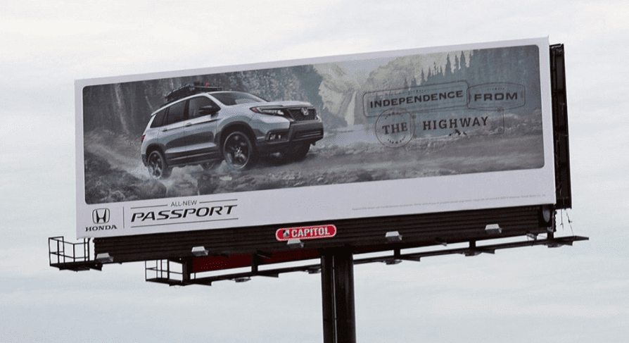
All New Passport
Rating: 2 (below average)
- What a great magazine ad! Unfortunately, it makes a bad billboard. Let’s start at the top.
- The imagery lacks visual punch. A grey car against a pastel background doesn’t really grab your prospects by the retinas and make them look at your ad.
- The tag line made from “passport stamps” is a nifty concept, but the letters are too small to read and there is not enough contrast between them and the background.
- I usually steer advertisers away from using borders on their OOH design since they eat up valuable messaging real estate and, on vinyls, emphasize the smallest installation misalignment or defect in the frame it’s wrapped around.
- Which brings us to the very small make and model logos. They are too small to be effective. This one earns a 2 (below average).
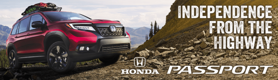
If given the option, I would have encouraged the advertiser to go in a direction more like this:
[wpforms id=”9787″]
Paid Advertisement


I agree 100%, and the improved version is beautiful.