
Rate This Board allows a billboard designer to rate a random piece of billboard artwork using the following scale: 1 (not good), 2 (below average), 3 (average), 4 (very good), 5 (great). Then the designer talks about what they may have done differently for outdoor advertising. This week’s rating is provided by Melody Roberts, an OBIE nominated billboard designer and founder of Out of Home Creative, an outdoor advertising design firm specializing in out of home design for businesses, agencies, media buyers and out of home companies. Melody has been in the outdoor industry since 1999.
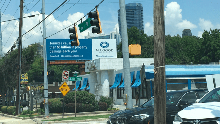
ALLGOOD
Rating 3 (average)
- The execution is clean but the readability has obstacles due to the boards location making it hard to read from most angles, even at a traffic light.
- In this case, where the board is surround by cables and poles it is important to keep the advertisement simple.
- There is too much copy on this advertisement which forces some information to be small. This execution could have been edited to make it much easier to read and more fun focusing on the smaller copy which is lost.
- I like statistics on billboards if they’re kept to a minimum which can be hard to do but I’ve done it on a digital billboard campaign
- The $5 billion is what caught my attention. The secondary part of the logo “Pest Solutions”, hashtags and website are so small I didn’t even make them out until I saw them on my computer.
- I’ve mentioned before that logos are usually not designed for out of home advertising so it’s important to talk to clients about how their logo may not read well on a billboard and show them ways to make it bolder or larger. Most clients will adapt to OOH if you modify their logo slightly for the greater good of their advertisement.
- For the copy, this would have been my suggestion:
- Termites cause $5 billion in property damage each year (eliminating “more than”). This would have allowed the copy to be 2 lines instead of 3.
- Delete #bugsallgoneitsallgood and only have #sawdust really large. It is shorter and I think more engaging.
- Bold and enlarge “Pest Solutions” under ALLGOOD.
- Consider either making the URL larger under the logo or eliminating all together. Most consumers will Google the business name for more information. For this board, I think the latter could have been done.
- This execution was almost there if only they had cut down on copy and taken a “less is more” approach.
[wpforms id=”9787″]
Paid Advertisement