


Rate This Board allows a billboard designer to rate a random piece of billboard artwork using the following scale: 1 (not good), 2 (below average), 3 (average), 4 (very good), 5 (great). Then the designer talks about what they may have done differently for outdoor advertising. This week’s rating is provided by Greg Callaham (www.gregcallaham.com) who has 30 years of experience in outdoor advertising design. Insider uses and endorses Callaham’s services.
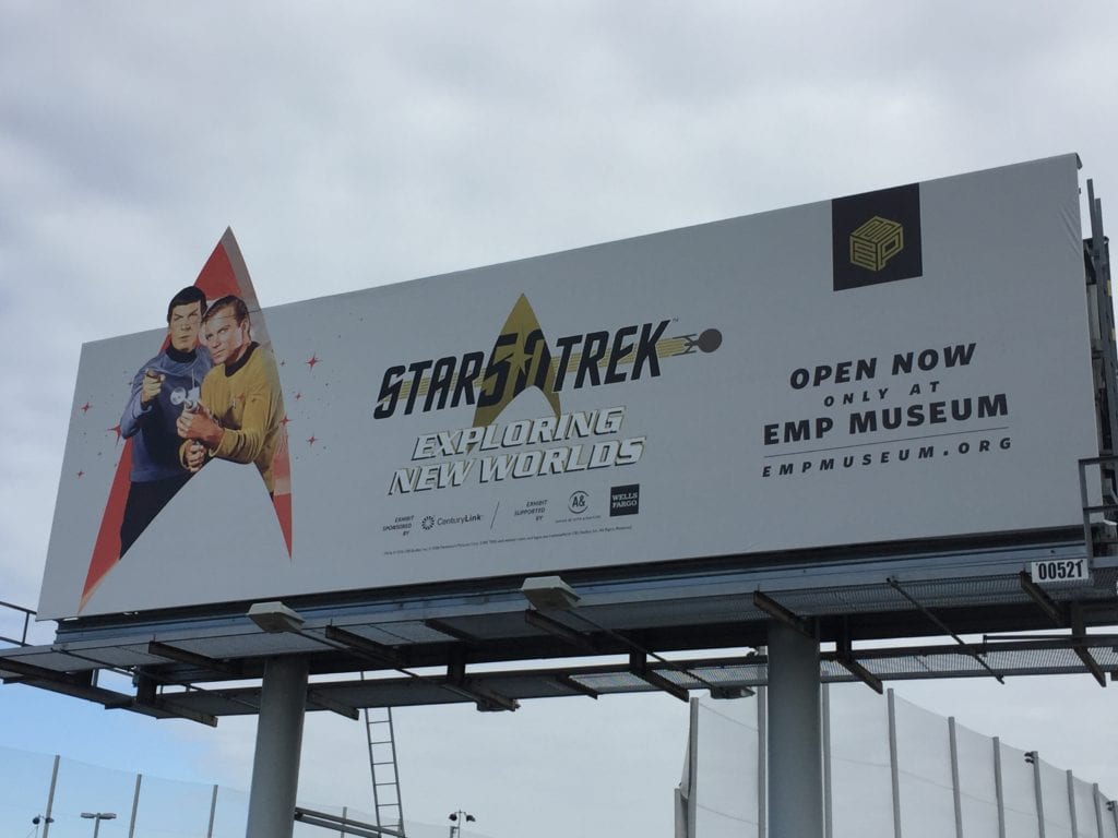
Star Trek
Rating: 2 (below average)
- I like Star Trek as much as most people, but I like good billboard design even more. This board has elements of good billboard design competing mightily with elements of poor billboard design.
- Kudos for the use of the Star Fleet insignia-shaped extension and the instantly recognizable image of Kirk and Spock. Wham! You know this board is about Star Trek. And then you wonder what the rest of it says.
- The logo in the middle is a mess, the too-small text underneath has almost no contrast with the background, there’s the small obligatory stuff movie makers have to add that everyone ignores, then there’s something in the black square, whatever this is advertising is open now.
- Maybe the reader also grasps the EMP Museum reference if they are familiar with the museum. This is probably based on other print advertising and simply did not transition well to outdoor without major design changes.
Paid Ad


Copy too small, and white on white even with a thin border. That might work great in magazine, direct mail, newspaper but not outdoor. You have all that space, use it to enlarge copy.