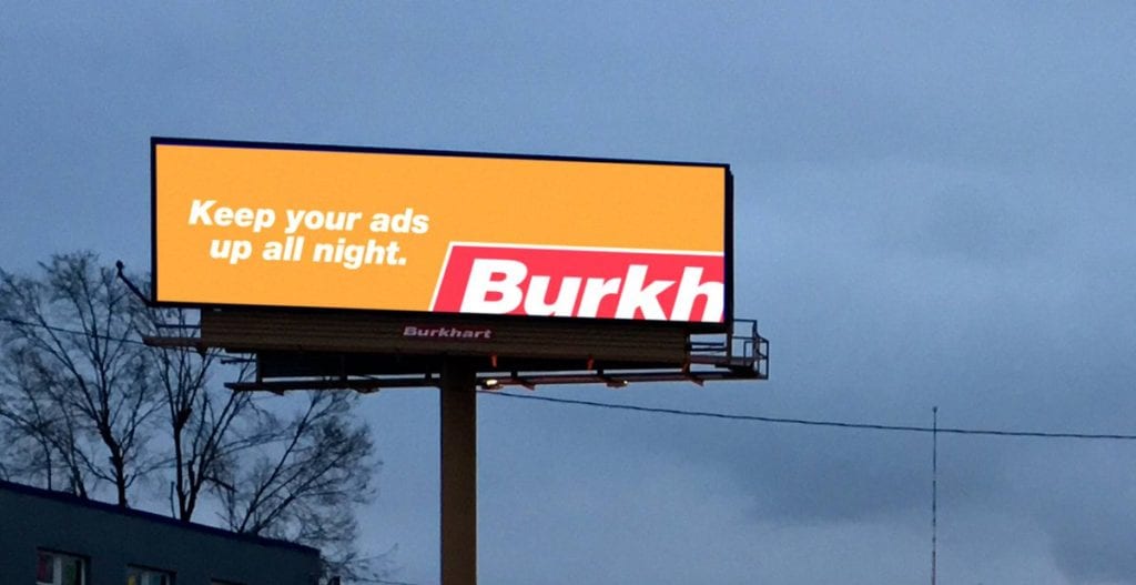
Rate This Board allows a billboard designer to rate a random piece of billboard artwork using the following scale: 1 (not good), 2 (below average), 3 (average), 4 (very good), 5 (great). Then the designer talks about what they may have done differently for outdoor advertising. This weeks rating is provided by Greg Callaham www.gregcallaham.com) who has 30 years of experience in outdoor advertising design. Insider uses and endorses Callaham’s services.
Space Available Burkhart
Rating: 2 (Below Average)
- I love simple. It’s what works best in outdoor. This self promo for Burkhart nails the concept of simple.
- I like the bright orange to grab the viewer’s eye, but I’m sure we could have grabbed their eye AND had higher contrast with the white text by going a shade or two darker on the orange. It’s just another way digital boards keep us designers on our toes.
- That’s the good stuff, now for the bad. I love it when an advertiser gives me free rein to do what I think is best to promote their brand, offer, location, etc. But I always make sure their brand integrity remains intact. They might think they have the market presence to play games with their business name or disguise their logo, but if the big boys (like Coca-Cola) rarely do it, the little guys (like everyone else) should do it even less. Most folks don’t pay attention to apron plaques unless they are in the outdoor industry or shopping for ad space, therefore, the Burkhart name has overwhelming recognition challenges. So instead of seeing a super clever peek-a-boo with the Burkhart logo, John Q. Public sees a malfunctioning digital billboard. That decision took this design from a 4 (very good) to a 2 (below average).
[wpforms id=”9787″]
Paid Advertisement

