


By Chris Cowlbeck
 We all know a pretty picture when we see one – I’m sure something just popped into your head. “A picture says 1000 words”, is a rather worn out phrase, but says it all. Generally, the more detail the better in pictures in a lot of marketing materials, as you want to convey as many words in the picture as possible.
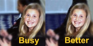
In a stationary environment, like a photograph in your hand, your eye has a lot of time to adjust and cipher out the details. But in outdoor advertising, we are limited to several seconds to grab the LOOKer’s attention first, then convey the message in as few words as possible. If you choose the wrong picture, or one that has too much detail, valuable time away from your message will be spent trying to figure out the pictures, and they miss the message.
At the same time, we must be catchy in order to grab the attention initially, and we try to find and use brightly contrasted colors, unique situations or isolate the subject of the picture. Backgrounds in many professional photographer pictures have brush stokes, colors, patterns, etc. and look great in the photo, but confuse the eye on a billboard – we tend to cut them out and go with a very simple color or subdued background pattern so the focus in on the person first, then the message.
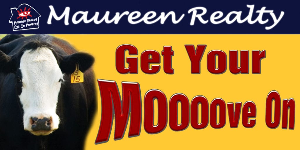
 Try to find some fun pictures that correlate with your business or venture, even if you don’t think they’ll work. Those of us that move pictures around for a living can do a lot of unusual things or apply some basic skills to the pictures that enhance the colors, fix the exposures and select parts of them that can be used. Some examples on this page will give you an idea.
Arbitron studies support that LOOKers want to see witty, funny and entertaining ideas. The right pictures help us do that. Finding the right ones for your business takes some time and some “out-of-the-box” thinking to find words to match up, but it can be done.
One at the bottom from a local realty office will illustrate finding the right pictures with a fun spin on some words we all use. Notice how eliminating the grass allows focus to be on the word stretch, while the cow sets it all up….
 Chris Cowlbeck is a busy guy. He runs Look Billboards a rural Oklahoma out of home company as well as the IBOUSA.
In his spare time Chris catches trout and blogs on billboard ad design at his company’s website. Insider running a series with Cowlbeck’s thoughts on out of home ad design.
You can reach Chris at chris@lookbillboards.com.
Paid Ad